


desi(gnable).
Insurance management * Designed
Designing India’s first unified digital insurance marketplace — built for 1.4 billion potential policyholders, and the agents, insurers, and regulators who serve them.
4–6%
Insurance penetration
India vs. global avg of 7%+
components shipped
DPDP-aligned
Business Rules
My Role
Lead Product Designer
My Team
Product, Engineering, Regulatory
Tools
Figma, Adobe Illustrator, ChatGPT, Claude, Replit, Notion AI, Claude Code
Deliverables
UX Research, Design System,
14+ Module Designs, FSDs
Duration
11 Months
Outcome
Regulator-approved national insurance platform
In a rush?
Catch the
magic without FOMO!
What did I do?
Led end-to-end UX for Bima Sugam — India’s national insurance marketplace — from regulatory specification to a shipped, regulator-approved design system across fourteen modules.
What did I find?
Four very different users — retail customers, agents, insurers, and system admins — needed to trust and use the same platform, with no shared insurance literacy or vocabulary to build on.
Why this problem?
India’s insurance penetration sits at 3–4%, against a global average of 7%+ — and a public rail that feels untrustworthy or exclusionary keeps that gap from closing.
What did I build?
A consent-first, DPDP-aligned design system spanning fourteen modules and four lines of business, built to work once for every one of those four users.
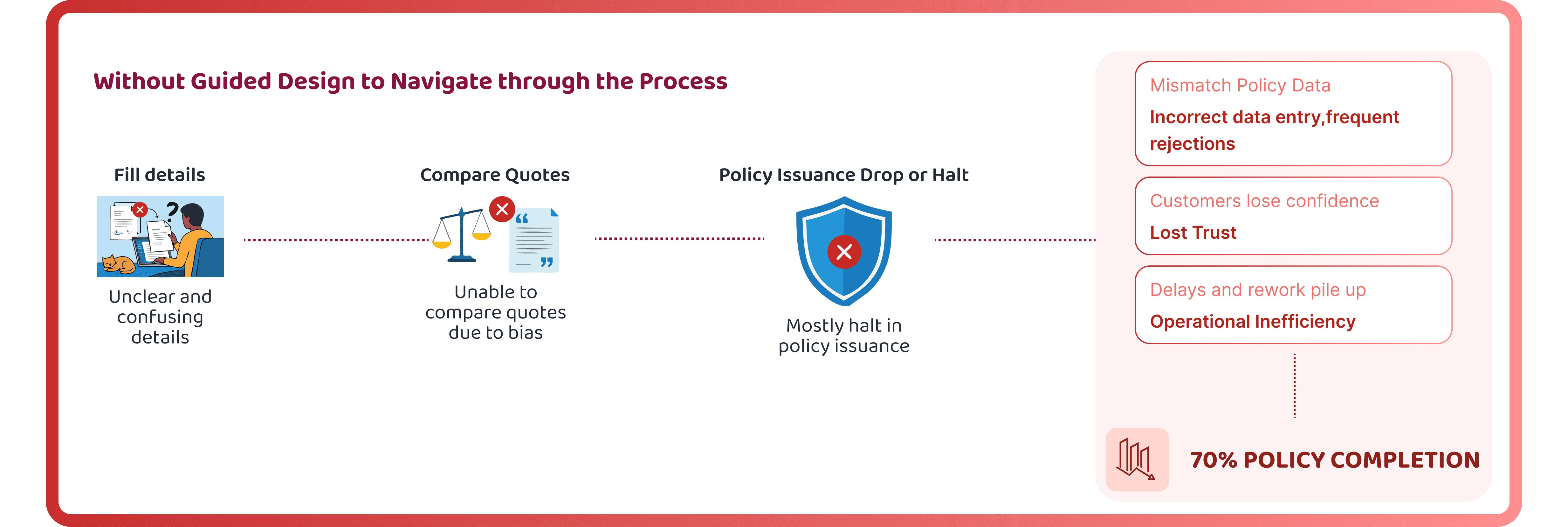
confusing & untrusted

Problem
+
Using AI

+

Design System
=
fast & consistent

Impact
Before we start
What is
Bima Sugam?
A unified digital insurance marketplace that lets customers access, compare, purchase and manage products from every insurer through one interface — with secure data sharing, customer consent management and real-time policy tracking, in compliance with the DPDP Act and IRDAI regulation. Not an aggregator. A protocol.
Not an aggregator
Neutral, regulator-aligned infrastructure operated by BSIF. The platform never takes a commercial position between customer and insurer.

Protocol-first
Insurance products sit at the core and technology is only ever the enabler beneath them, never the other way round.
Consent-governed
Every data movement on the platform is gated by an explicit, revocable, purpose-bound grant under the DPDP Act.
Interoperable
Built on India Stack — Aadhaar eKYC, NSDL PAN verification, UIDAI OTP and secure delivery at national scale.

Why it matters
Four numbers
that set the stakes
3–4%
India's insurance penetration, concentrated in urban metros
1 B+
People the platform is ultimately meant to reach
User stories across fourteen module specifications
Rounds of regulator feedback on Consent Management alone
WHO I WAS DESIGNING FOR
Four very different users, one platform
A retired teacher buying her first health cover and a platform admin managing insurer provisioning both live inside the same product. The design had to flex without fracturing.
R
Retail Customer
First-time or returning
Little prior insurance literacy
Needs plain language, no jargon
Wants proof the platform is official
A
Agent / Distributor
Distribution partner
Onboards and services customers
Operates on consent-based access
Lives in dashboards all day
I
Insurer
Product owner
Configures products and rates
Receives leads with pre-filled data
Needs clean KYC and reporting
S
System Admin / DPO
The neutral operator
Onboards insurers and agents
Oversees consent and grievances
Monitors audit trails and health
Scope
One designer,
fourteen modules.
The full scope spanned 14 interconnected modules. Each designed to stand alone while remaining part of a coherent, regulated system.
Policy Discovery
Browse all IRDAI-listed insurance products
Premium Calculator
Instant quotes across competing insurers
Online Purchase
End-to-end digital policy issuance
Nominee Management
Add and update nominees digitally
Grievance Redressal
Complaint filing with SLA tracking
Renewal Centre
Automated reminders and one-tap renewals
Surveyor Workspace
Field assessment and report submission
Document Vault
Encrypted storage for policy documents
IRDAI Reports
Regulatory compliance and audit exports
Policy Locker
Centralized vault for all active policies
Claims Portal
FNOL to settlement in one digital flow
Agent / PoSP Portal
Sales, renewals, and client management
Insurer Dashboard
Product listings, claims, and analytics
KYC & eKYC
Aadhaar-linked identity verification
Modules designed
FSDs delivered
UI/UX sign-offs
Lines of business
MY DESIGN GAMEPLAN
A hierarchy
of what to get right
For public infrastructure the order matters. Compliance is the floor you build on; trust and inclusion are what you are actually trying to reach.
Regulatory Complexity Stack
Compliant
Functional
Usable
Trustworthy
Inclusive
Each layer has distinct stakeholders, timelines, and update cadences.
Compliant
DPDP Act and IRDAI requirements encoded into components, not bolted on afterwards.
Functional
Fourteen modules, hundreds of stories — each has to work end to end before it is allowed to look good.
Usable
Standardised patterns, so a person learns the platform once and never relearns it in the next journey.
Trustworthy
A visual language that signals neutral, government-grade infrastructure: calm, verified, never salesy.
Inclusive
Multilingual, low-literacy friendly, works on modest devices, with explicit provision for assisted consent.
Delivery Context
Inside the cycle
Regulatory workshops, insurer onboarding sessions and specification reviews across the Drop 2 delivery cycle.
Months on the project
Modules specified
User stories reviewed





Opportunity
Where design
Four pressure points surfaced across the specifications where design decides whether a national rail is trusted or abandoned.
01
Identity without exclusion
Bima Pehchan ID has to be strong enough to satisfy KYC and soft enough that a person without PAN to hand is not locked out of the platform entirely.
💡
Breakthrough: make PAN skippable, verify against NSDL where present, and never let a missing identifier end a journey
02
Consent as infrastructure
Consent could have been a checkbox on a form. Built instead as a component with per-purpose grants, expiry and revocation, it became the layer every other module depends on.
💡
Breakthrough: Unify fragmented quality signals into one connected data layer managers can act on
03
Neutrality by construction
A public rail cannot rank insurers. Randomised ordering, claim-ratio disclosure and the absence of promotional surfaces are design decisions that encode that constraint.
💡
Breakthrough: consent as a reusable component, not a screen — which is what let it survive six rounds of regulator feedback
04
One system, four lines of business
Term life, health, travel and motor each arrived with their own specification. Rendering them in one visual language is what makes the platform learnable once rather than four times.
💡
Breakthrough: a shared component library so a customer learns the platform once and never relearns it
Precedent
What UPI and ONDC taught me

What the work taught me
Designing
a public rail
Specifications move
The DPDP Rules changed mid-module. In regulated design the brief is a moving target, so the system has to absorb change without a redraw.
Neutrality is a design property
The moment a public rail looks like it is selling something, trust drops. That single constraint decided the palette, the ordering and the absence of promotional surfaces.
Compliance is a component
Encoding DPDP and IRDAI requirements into components rather than bolting them onto screens is what made fourteen modules stay consistent under audit.
Provenance must be honest
Auto-filled fields carry a live badge that flips to Edited by you the moment a customer changes them. Interfaces should never misrepresent where data came from.
Design for the last user
The person who has never bought insurance, does not trust the industry, and is on a four-year-old Android in a town with no advisor sets the floor for every decision.
Deep-dive research

Medium
4 min read
UX Research
Field Study
Bima Sugam
Designing Consent for a National Insurance Rail
What six rounds of regulator feedback on a single module taught me about building interfaces that survive their own compliance baseline changing.
V
Vartika
Product & UX Design Lead
FINAL DESIGN · WEB PLATFORM
The
desktop platform
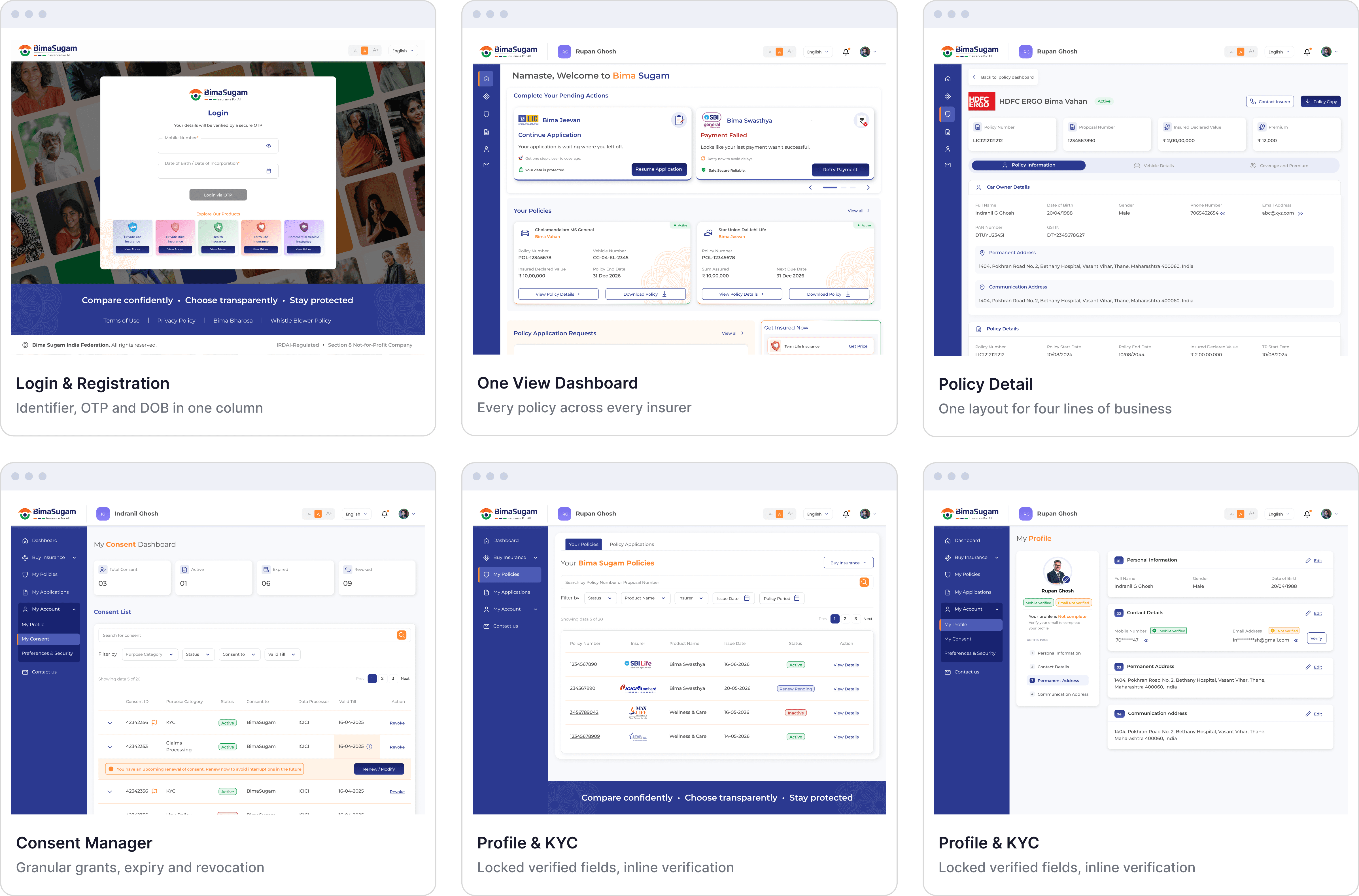
Nine surfaces, one shared library — the customer front door, the agent working day and the admin configuration layer, all speaking the same language.
GROUP 1
One View Dashboard
First touchpoints for customers — secure login, OTP-based registration, consent collection, and initial car-specifics capture. These six screens define the trust-building entry corridor before any policy action is taken.
View in Figma
GROUP 1
Motor Journey
First touchpoints for customers — secure login, OTP-based registration, consent collection, and initial car-specifics capture. These six screens define the trust-building entry corridor before any policy action is taken.
View in Figma

GROUP 3
Health Journey
First touchpoints for customers — secure login, OTP-based registration, consent collection, and initial car-specifics capture. These six screens define the trust-building entry corridor before any policy action is taken.
View in Figma

🧤
Consent-first interactions
Every data movement is gated by an explicit, purpose-bound grant the customer can withdraw in one tap.
📶
Honest provenance
Auto-filled badges flip to Edited by you the moment a value changes, so the interface never misstates its own data.
FINAL DESIGN · Mobile PLATFORM
The
mobile journeys
Nine surfaces, one shared library — the customer front door, the agent working day and the admin configuration layer, all speaking the same language.
View in Figma

Splash Screen
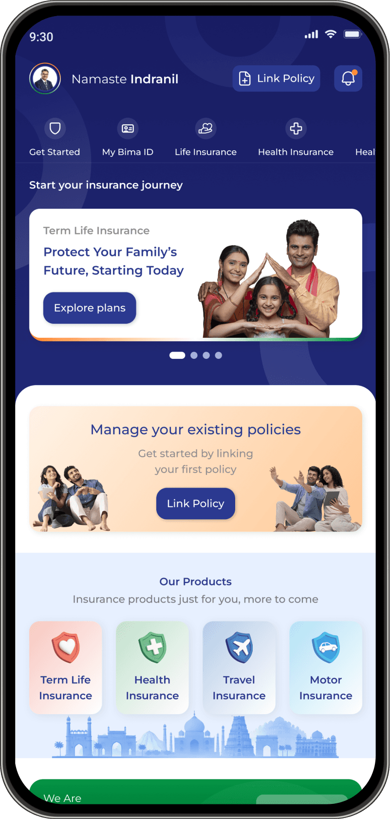
Non- Loggedin Dashboard

Logged in Dashboard

Insurer List

Consent Dashboard
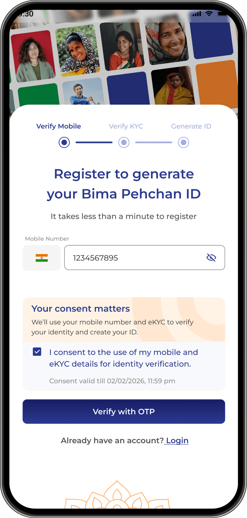
Registration for Bima Pehchaan

OTP

Bima Pehchaan

Review Page

Success Page
🧤
Consent-first interactions
Every data movement is gated by an explicit, purpose-bound grant the customer can withdraw in one tap.
📶
Honest provenance
Auto-filled badges flip to Edited by you the moment a value changes, so the interface never misstates its own data.
⚡
44px throughout
Every control meets the 44px minimum and WCAG 2.1 AA contrast, on modest devices as well as flagships.
DESIGN DECISIONS THAT STUCK
Six things
I pushed back on
Consent boxes ship unticked
A pre-ticked consent box is a dark pattern and fails the DPDP Act standard for freely given consent.
Consent gate before the fetch
Add Policy captures consent before calling the insurer API, because the call is the data access.
Random insurer ordering
A neutral rail cannot rank insurers, so the comparison grid randomises order on every load.
Cancel on auto sign-out
A 10-second cancel window on the inactivity warning, for the person reading a policy document slowly.
Concrete step trackers
Vague progress bars replaced with named steps, so a stalled journey tells you which step stalled.
Verified fields lock visibly
KYC-verified data is locked and styled differently, so nobody wonders why a field will not take input.
Final Design
The difference
design made
11-month build · 14 modules · Regulator-approved
DELIVERY TIMELINE
kickoff to regulator sign-off
Product, Engineering, and Regulatory working as one team
REGULATOR REVIEW
rounds of feedback survived
Consent built as a component, not a checkbox on a form
MODULE COVERAGE
modules specified end to end
From policy discovery to grievance redressal
NATIONAL REACH
1B+
potential policyholders
India’s insurance penetration sits at 3–4%, against a global average of 7%+
ACCESSIBLE TAP TARGETS
modest-device friendly
WCAG 2.1 AA contrast, on modest devices as well as flagships
ONE SYSTEM, FOUR LINES
4
lines of business, one shared library
Term life, health, travel, and motor — learned once, not four times
Final Design
The difference design made
THE RULES I DESIGNED AGAINST
Principles, not preferences
UX laws
How the journeys were structured — sequencing, load and expectation.
Hick’s Law
The insurer comparison grid caps at five products at a time. Facing forty term-life plans at once, a first-time buyer does not choose slowly — they abandon.
Miller’s Law
The health journey is chunked into member selection, cover, pre-quote choices and review. No single screen asks for more than a handful of related decisions.
Jakob’s Law
OTP entry, the policy list and the notification inbox use the conventions people already know from banking apps, so nothing has to be relearned.
Progressive disclosure
Room type, deductible and co-pay are chosen before the price appears, so the number is never a surprise and the reasoning is never hidden.
Zeigarnik effect
The Application Tracker keeps incomplete journeys visible on the dashboard, because a half-finished purchase that disappears is a purchase that never completes.
Peak-end rule
Consent and issuance — the moments of highest anxiety and highest relief — got the most design attention, because they set the memory of the whole journey.
Postel’s Law
Identifier entry accepts a mobile number, an email or a Bima Pehchan ID and normalises them, rather than forcing the customer to know which one we want.
UI rules
How each screen was built — controls, feedback and legibility.
Affordance
Verified KYC fields are locked and visually distinct from editable ones, so nobody wastes a tap discovering a field will not accept input.
Fitts’s Law
Every control meets a 44px minimum with 8px spacing. Destructive actions such as consent withdrawal sit away from the primary path.
Feedback & visibility of status
OTP carries a live countdown, resend unlocks at 30 seconds, and API retries are surfaced with a stated reason rather than a spinner.
Constraint over correction
PAN format is validated client-side before submission, so the interface prevents the error instead of reporting it afterwards.
Error recovery
Every failure state names what went wrong and offers a route forward — retry, resend, or an alternative path such as skipping PAN.
Consistency & standards
One component library across fourteen modules. A dropdown in the motor journey behaves identically to a dropdown in the health journey.
Accessibility (WCAG 2.1 AA)
Contrast verified on every token pairing, multilingual copy, and low-literacy phrasing tested for modest devices as well as flagships.
Aesthetic-usability, resisted
A neutral rail cannot look like it is selling. Promotional surfaces were removed even where they would have tested well.
Where a law and a regulation conflicted, the regulation won. Aesthetic-usability would have argued for a warmer, more persuasive interface — the DPDP Act and IRDAI neutrality requirements argued for a plainer one. That trade-off is the case study.
Design System
One design system
under all of it.
A purpose-built component library for Bima Sugam — not adapted from a generic UI kit. Every token, every component, every pattern was designed to serve the specific context of regulated financial services in India.
Built in Figma with published variables and auto-layout components, handed off with full Storybook documentation for the engineering team.
View Design System in Detail
Color modes
Components
Icon sets
Patterns
Type Scale
Aa
Display
Aa
H1
Aa
H2
Aa
Body
Colour Tokens
Navy
Purple
Lavender
Amber
Emerald
Cloud
Component — Button
Primary
Secondary
Ghost
Warning
AI tools in the workflow
Fourteen modules, one designer, six months. These are the tools that made that arithmetic possible — and an honest note on what each did and did not do.
Human-led, AI-assisted
A considered use of emerging tools
Every AI output was treated as a starting point. Compliance decisions, dark-pattern removals and regulator trade-offs were mine.
Claude
Design partner & prototyping
Built interactive HTML prototypes of flows before they went into Figma, so structure could be tested before pixels were committed.
Read the functional specifications alongside me and caught a pre-ticked consent box, a GSTIN field rendering a masked email, and a duplicate date-of-birth field.
Drafted and pressure-tested UX copy for warnings, consent notices and non-disclosure messaging.
Claude Code + Figma MCP
Component build
Built components programmatically straight into the Figma library, which is how fourteen modules stayed consistent without copy-paste drift.
Rebuilt the height input with its cm and feet-inches toggle directly in Figma across two iteration rounds.
Assembled this case study page itself — layout, tokens and content — as a working demonstration of the workflow.
Figma Make
RAPID LAYOUT
Built interactive HTML prototypes of flows before they went into Figma, so structure could be tested before pixels were committed.
Read the functional specifications alongside me and caught a pre-ticked consent box, a GSTIN field rendering a masked email, and a duplicate date-of-birth field.
Drafted and pressure-tested UX copy for warnings, consent notices and non-disclosure messaging.
Recraft
ILLUSTRATION
A consistent flat vector illustration set for empty states and onboarding, generated from one locked custom style so the set never drifted.
Tokens Studio
RAPID LAYOUT
Design tokens kept in sync between the Figma library and the engineering handoff, so a colour change was one edit and not fourteen.
Notion AI
DOCUMENTATION
The living style guide the wider team actually opened, rather than a PDF nobody read.
Behind the design
Field interviews with insurance agents
Affinity mapping the pain points
How-might-we workshop
Early sketches
Contextual inquiry sessions
From sketch to shipped product
Field interviews with insurance agents
Affinity mapping the pain points
How-might-we workshop
Early sketches
Contextual inquiry sessions
From sketch to shipped product
★
NEXT PROJECT
03/04
Design System — One Language for BimaSugam
→
The token-driven system behind BimaSugam — cutting design-to-dev handoff time by 45%, lifting token compliance to 92%, and unifying 6 product journeys across 3 vendor teams.
Design Systems
Governance


Case study — 5 min read
Read it →
Bima Sugam · Product Design Case Study
Designed by Vartika · 2025–2026