

Design System
One Language for a National Insurance Marketplace
I built and governed the design system behind BimaSugam — IRDAI’s regulated insurance marketplace — cutting design-to-dev handoff time by 45%, lifting token compliance to 92%, and unifying 6 product journeys across 3 vendor teams.
My Role
Lead Product Designer
My Team
Product, Engineering, Regulatory
Tools
Figma, Adobe Illustrator, ChatGPT, Claude, Replit, Notion AI, Claude Code
Deliverables
UX Research, Design System,
14+ Module Designs, FSDs
Duration
11 Months
Outcome
Regulator-approved national insurance platform
Why BimaSugam
Needed a System
BimaSugam is a regulated marketplace: multiple insurers, multiple vendor squads, and IRDAI-mandated disclosures rendering across the same screens. Before the system, every journey re-invented its own patterns — which meant inconsistent compliance copy, drifting spacing, and slow releases.
Disconnected UI kits in circulation
of screens using off-token colours
vendor teams shipping in parallel
~2 wks
average design–dev handoff cycle
fragmented & inconsistent

Problem
+
+
Using AI


Token Governance
=
unified & compliant

Impact
What the
Design System Solves
BimaSugam is a regulated marketplace: multiple insurers, multiple vendor squads, and IRDAI-mandated disclosures rendering across the same screens. Before the system, every journey re-invented its own patterns — which meant inconsistent compliance copy, drifting spacing, and slow releases.
Consistency
A single token set and component library so every insurer journey looks and behaves the same.
Compliance
IRDAI disclosure, consent and disclaimer patterns baked into components, not bolted on per screen.
Speed
Reusable, documented components cut handoff and QA cycles for three parallel vendor squads.
Accessibility
WCAG AA contrast, 44px targets, and focus states defined once at the foundation layer.
Behind the design

Design tokens & components

Screens built from the system

A real screen using the system
Design tokens & components
Screens built from the system
A real screen using the system
Foundations
Colour
BimaSugam is a regulated marketplace: multiple insurers, multiple vendor squads, and IRDAI-mandated disclosures rendering across the same screens. Before the system, every journey re-invented its own patterns — which meant inconsistent compliance copy, drifting spacing, and slow releases.
Primary — Indigo
100
#E9ECF7
200
#C4CAE6
300
#8B94CE
400
#404BA7
500
#2E398B
600
#212A66
Success
100
#E9F6ED
200
#BAE2C7
300
#94D2A7
400
#4E9F62
500
#41924D
600
#2E6B38
Warning
100
#FEF9DD
200
#FBE6B6
300
#F8D789
400
#F5BF4F
500
#D99F36
600
#A87826
Error
100
#FBECEA
200
#EFCFCB
300
#DBB0AC
400
#C05043
500
#A53428
600
#7C251C
Accent — Violet
100
#F1EAFE
200
#D3BBFA
300
#B287F8
400
#9456F6
500
#8D4BF6
600
#6A31C4
Neutral
0
#FFFFFF
50
#F8F9FC
100
#EDEFF1
300
#D3D3D3
500
#8C8C8C
900
#2E2F32
Foundations
Typography
One typeface does all the work. Montserrat, from ExtraBold display down to a 10px caption — 46 real styles across two ramps, held at 150% line-height.
Typeface
Aa
Montserrat
Regular · Medium · SemiBold · Bold · ExtraBold
ABCDEFGHIJKLMNOPQRSTUVWXYZ
abcdefghijklmnopqrstuvwxyz 0123456789
Desktop ramp
Bima Sugam
ExtraBold / 3XL · 40px
Bima Sugam
SemiBold / 2.5XL · 32px
Bima Sugam
Bold / 2XL · 24px
Bima Sugam
SemiBold / XL · 20px
Bima Sugam
Regular / L · 18px
Bima Sugam
SemiBold / Base · 16px
Bima Sugam
Medium / SM · 14px
Bima Sugam
Regular / XS · 12px
Bima Sugam
SemiBold / 2XS · 10px
Foundations
Spacing & Grids
Spacing scale
space-1
4px
space-2
8px
space-3
12px
space-4
16px
space-6
24px
space-8
32px
space-12
48px
Assets
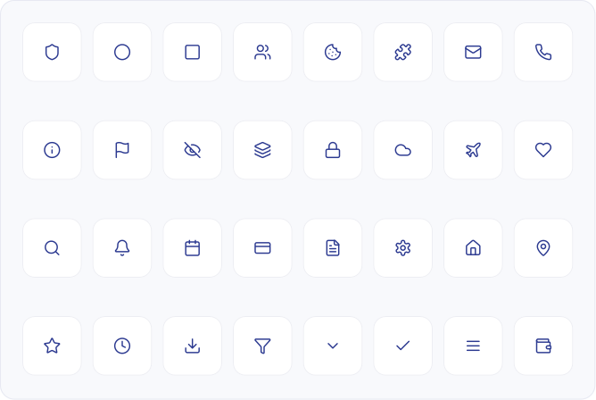
469 icons, 18 families
A stroke-consistent line set spanning everything from Interface and Arrows to Finance and Insurance — every icon a real, named component.
Signature Assets
3D insurance icons
Six sculpted shield marks give each insurance line its own identity — rendered as real raster assets straight from the library, ready to drop into cards, nav and journeys.

Health
Shield · 3D

Term Life
Shield · 3D

Travel
Shield · 3D

Motor
Shield · 3D

Fire
Shield · 3D

SME
Shield · 3D
Components
Buttons
Four hierarchies, three sizes, five states. Primary is reserved for the single forward action on a screen — in a quote journey that is always “Buy now”, never a filter.
Hierarchy
Primary
Buy now
Secondary
Compare
Tertiary
View details
Destructive
Cancel policy
States · Primary
Default
Buy now
Hover
Buy now
Pressed
Buy now
Disabled
Buy now
Loading
Processing…
Sizes
Large · 48px
Medium · 40px
Small · 32px
Components
Input Fields
Every field carries a label, an optional helper line, and a reserved error slot — so validation never shifts the layout. Critical for KYC and IDV entry, where a shifting form loses users mid-journey.
States
Vehicle registration number
Enter registration number
Default · as printed on the RC
Vehicle registration number
CG04 MK 1234
Focus · 2px indigo ring
Vehicle registration number
CG04MK
Error · Enter a valid registration number
Variants
PAN number
ABCDE1234F
Success · Verified with the KYC registry
Insured Declared Value (IDV)
₹ 4,85,000
Prefixed field · range ₹4.1L – ₹5.4L
Policy number
BSG/2026/0098421
Disabled · auto-filled from the policy record
Components
Selection & Dropdowns
Selection controls carry the regulatory weight of the product — consent checkboxes, add-on toggles, policy-duration choices. All are 44px minimum targets with a visible focus ring.
Checkbox, radio, toggle
I consent to sharing my KYC data with the insurer
Send policy updates on WhatsApp
Comprehensive — own damage + third party
Third party only — statutory minimum
Zero depreciation add-on
Roadside assistance add-on
Dropdown & segmented control
Policy duration
▾
1 year
2 years
3 years · recommended
5 years
Motor
Health
Travel
Term
★
NEXT PROJECT
04/04
WALL·E — Content Validation, Reimagined
→
Walmart's internal content validation tool, ensuring every product listing is accurate, complete, and trustworthy before it goes live.
Walmart
Content Ops


Case study — 5 min read
Read it →
Components
Selection & Dropdowns


Components
Alerts & Feedback
Policy issued
Your policy document has been emailed and is available under My Policies.
Success
IRDAI disclosure
Premium shown is inclusive of 18% GST. Cover begins only after successful payment realisation.
Information
Quote expiring
This quote is valid for 12 more minutes. Premiums may change after re-calculation.
Warning
Payment failed
The transaction was declined by your bank. No amount has been debited — please retry.
Error
Components
Data Tables
Policy and claim tables run to hundreds of rows on desktop. The spec fixes row height at 52px, right-aligns all currency, and pins the status column — so scanning down a column always compares like with like.
Governance &
Adoption
A system nobody follows is a moodboard. Adoption was designed as deliberately as the components — versioned releases, a contribution path for vendor squads, and an audit plugin that makes drift visible instead of arguable.
Versioned releases
Tokens ship through Tokens Studio with semantic versioning. Breaking changes get a migration note and a two-sprint deprecation window.
Contribution path
Vendor squads propose components through a template; anything used in 3+ places is promoted into the core library.
Design System Auditor
A Figma plugin I built that flags off-token colours, type and spacing per file — turning compliance from a review argument into a number.
Living documentation
Every component carries usage, do/don’t, and the regulatory constraint it satisfies, so intent survives handoff.
Bima Sugam · Product Design Case Study
Designed by Vartika · 2025–2026