Quality
Inspection
Quality * Inspection, Reimagined
Designed Quality Inspection (QI), a Walmart application that streamlines the post-pick quality check process for 80,000+ store associates handling 100,000+ inspections anually, improving speed by 40% and reducing error rates by 60%.
80K+
Store Associates
Faster Inspections
Fewer Errors
My Role
User Experience Designer
My Team
Marketing, Sales, Development
Tools
Figma, Adobe Illustrator, ChatGPT, Fireflies.ai
Deliverables
UX Research, UX Design, UI Design, Prototyping, Usability Testing
Duration
5 Months
Outcome
Fully shipped end to end Mobile app for B2B
In a rush?
Catch the
magic without FOMO!
What did I do?
Led end-to-end UX for Walmart's Quality Inspection app — from field research to shipped, pilot-ready hi-fi designs.
What did I find?
Associates were skipping checks because the existing tool was slow, cluttered, and built for desks — not the warehouse floor.
Why this problem?
Missed quality checks meant wrong items reaching customers, driving costly returns and eroding trust at massive scale.
What did I build?
A fast, glove-friendly mobile flow with clear checklists, slide-to-remove scans, and one-tap reporting.
rushed & skipped checks

Problem
+
Using AI

+

Field Research
=
confident & compliant

Impact
Before We start
What is
Quality Inspection?
Quality Inspection (QI) is the step where associates double-check picked orders for accuracy and condition before they're dispensed to customers. It catches mistakes early, here's what it covers.
Right Item, Right Order
Confirm every picked product matches the customer's order before it leaves the building.
Condition & Count
Verify quantity, freshness, and packaging condition so nothing damaged slips through.
Last-Mile Safeguard
A final checkpoint that protects customer
trust before dispatch and delivery.


Why it maters
Four wins
that compound at scale
Reduced Returns
Fewer · Wrong · Sends
Faster Operations
Quick · Clear · Flow
Better Visibility
See · Track · Trust
Employee Efficiency
Confident · Calm · Capable
The Problem
The old inspection tool was built for a desk, not a warehouse floor.
Associates juggling gloves and carts found it slow and cluttered, so quality checks got rushed or skipped, and wrong items reached customers, driving expensive returns at massive scale.
80K+
Inspections < 30 days old
Completed at massive scale
5 mo
End-to-end design timeline
The People
Who
I was designing for
Store Associates
across Walmart locations nationwide rely on this app daily
NEW EMPLOYEE
Still learning the ropes
Needs clear, guided steps and reassurance that they're doing each check correctly.
EXPERT EMPLOYEE
Fast and fluent
Wants speed and shortcuts, minimal taps, no friction, trust to move quickly.
Warehouse Associates
Glove-friendly UX
High-volume workflow
Mobile-first
How I Tackled the Chaos
My
Design Gameplan
Delightful
Usable
Reliable
Compliant
Functional
Functional capture every inspection accurately
Replaced fragmented paper flows with one structured digital form, covering item intake, defect logging, photo evidence, and pass/fail decisions.
Compliant built on quality standards and regulations
Mandatory fields, sign-offs, and evidence rules aligned every flow to quality standards and regulations, making each inspection defensible and audit-ready.
Reliable trustworthy defect data and audit trails
Standardized defect categories and validation rules made every report consistent and traceable, cutting mismatched findings by 60%.
Usable, fast, low-friction inspection on the floor
Large tap targets and offline-friendly capture helped inspectors complete checks 40% faster, with clear guidance that cut training time.
Delightful, clarity that builds inspector confidence
Real-time dashboards, visual defect heatmaps, and instant pass/fail feedback turned a compliance chore into a confident, insight-driven process.
Heuristic Evaluation
Evaluating the
existing mobile QI app

Current Tote Details screen (annotated)
H1
Visibility of System Status
"Indicate Priority & Steps to the QC process" is unchecked on all three screens (Totes, Time Slot, Tote Details) associates get no sense of where they stand.
H2
Match Between System & Real World
“Non-Weighted,” “Weighted,” and “Preferred Quantity weighted” are inventory-system groupings, not language an associate would use to describe what’s in the tote.
H3
User Control & Freedom
"Already completed" is a dead end with no self-serve correction. Previous-day orders live in a separate view instead of surfacing in the current time slots.
H4
Consistency & Standards
Time slots expand only via the small chevron, not the row itself, inconsistent with the full-card tap pattern used on Tote Details and item cards.
H5
Error Prevention
No "have you scanned everything? Y/N" confirmation before Action Items. "Select Quantity" only errors after Done is tapped, instead of blocking submission earlier.
H6
Recognition Over Recall
5 item-card variants (Each, Weighted, Preferred Qty, With location, Unavailable image) each imply different handling, associates must remember the rule per type mid-scan.
H7
Flexibility & Efficiency of Use
The requirement to “allow any click along the time slot to expand (not just chevrons)” flags a real tap-target cost repeated dozens of times per shift by experienced associates.
H8
Aesthetic & Minimalist Design
Tote Details is dense (checkboxes, weights, UPCs) but grouped into clear Non-Weighted/Weighted accordions, functional density, not clutter. Minor concern only.
H9
Recognize, Diagnose & Recover from Errors
A relative strength: “Unable to scan” and “This isn’t right” states do suggest a next action. But “Just a moment…” and “Select Quantity” give no explanation of what’s happening.
H10
Help & Documentation
No help/info affordance appears anywhere across Totes, Time Slot, Tote Details, or Report Issue, no legend for priority, item type, or exception meanings.
Real-Time Research
From the Field
Photos and artifacts from warehouse visits, associate sessions, and contextual inquiry.
Weeks embedded
Store locations
Associates interviewed
Hours observed


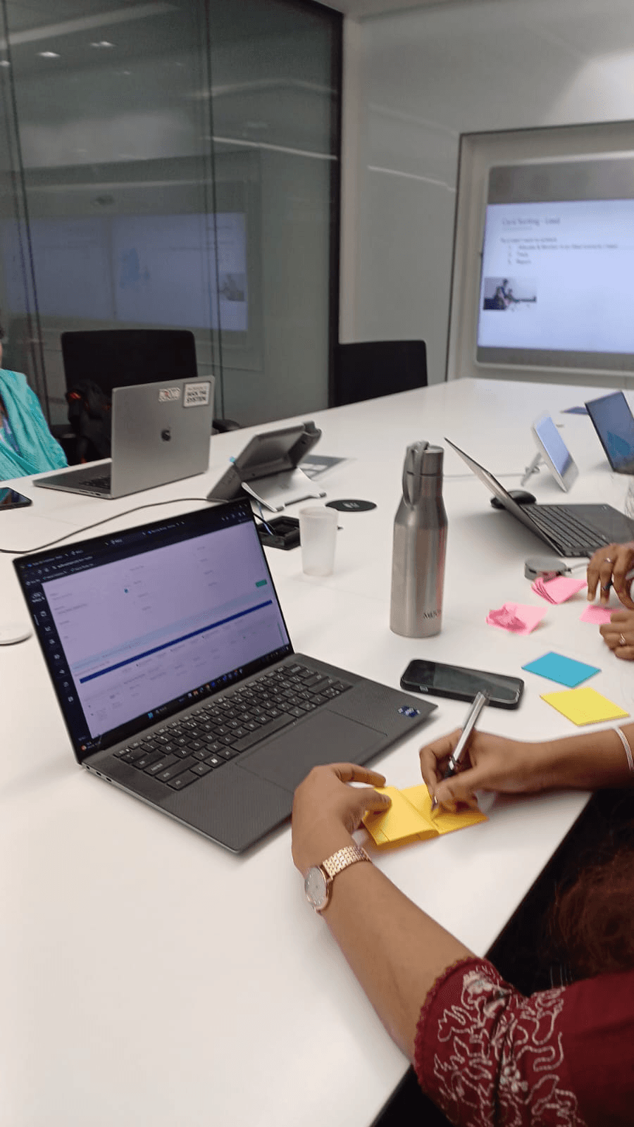


Opportunity
Where the
product could break through
Research surfaced four distinct pressure points where a well-designed QI app could move from nice-to-have to essential infrastructure for Walmart's store operations.
01
Floor Accessibility
The existing QI tool was designed for a desk, not a warehouse floor. Associates needed a native mobile experience that works in motion, with gloves, under time pressure, in low-light aisles.
💡
Breakthrough: Move QI from a back-office tab to a thumb-first mobile flow that lives on the floor
02
End-to-End Quality
💡
Breakthrough: Unify fragmented quality signals into one connected data layer managers can act on
03
Linking
💡
Breakthrough: Collapse three separate tools into one seamless, scan-first inspection loop
04
Store Transformation
💡
Breakthrough: Set the UX standard for Walmart's next wave of associate-facing store-tech tools
Competitor Analysis
Learning from Target

Opportunity
What the
floor taught me
Speed over completeness
Associates need to move fast. A flow that asks too many questions is a flow that gets skipped. Every tap must earn its place.
Large tap targets, always
Gloves reduce precision drastically. Buttons must be thumb-sized, well-spaced, and never stacked where a miss costs a re-tap.
Scan over type
Typing on a warehouse floor with gloves on is near-impossible. Barcode scanning and voice input dramatically cut input friction.
One-tap reporting
When something's wrong, reporting it should take one action — not a multi-step form. Speed of escalation matters for accuracy.
Offline resilience
Connectivity in large warehouses is patchy. The app must queue data locally and sync silently, associates can't afford to wait.
Deep-dive research

Medium
4 min read
UX Research
Field Study
Walmart
What the Warehouse Floor Taught Me About Designing for Speed
V
Vartika
UX Designer at Walmart
Final Design
The
Prototype
A glove-friendly, scan-first mobile flow. Built for the warehouse floor, validated with 14 associates across 3 stores.
View in Figma
01
Quality inspection

The complete flow of Quality Inspection for weighted and non-weight items.
02
Updating Quantity

Flow to update the Quantity of the items in the order
03
Review & Submit

A slide to remove option for the scanned items. This enables the employees to easily remove scans apart from the other options.
04
Complete
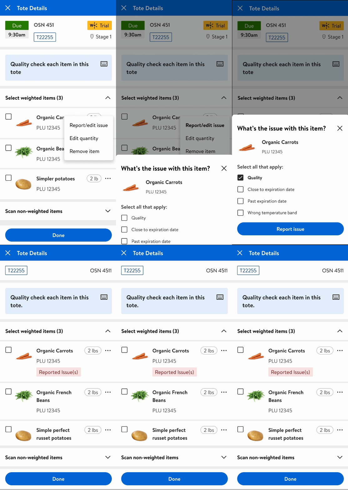
Flow to report the items in the order
🧤
Glove-native interactions
📶
Offline-first data layer
Inspections queue locally and sync silently when connectivity returns. Zero lost sessions in dead zones.
⚡
Sub-3 minute flow
Final Design
Shipped.
Measured. Validated.
The redesigned QI app went live in a pilot across 3 stores with 200+ associates.
Results were tracked over 8 weeks, and the data matched what the research
had promised.
"Before this app, I'd skip QI on busy days just to keep up with the pace. Now I can do a full check in half the time, it actually fits how we work on the floor."
A
Associate, Store #2284
Pilot participant · 4 years at Walmart
Faster inspection time
vs. baseline avg of 4.2 min per QI
Reduction in error rate
wrong items submitted fell from 8.3% to 3.4%
Task completion rate
up from 61% with the old tool
4.6★
Associate satisfaction
out of 5 in post-pilot survey (n=214)
Final Design
The difference
design made
8-week pilot · 3 stores · 214 associates
Inspection time
faster
4.2 min
2.5 min
Fast enough to never skip
Error rate
fewer errors
Mis-picks caught before dispatch
Session completion
completion
Full QI runs every single shift
Associate satisfaction
×2.2
satisfaction
2.1 / 5
4.6 / 5
Tool associates actually want to use
Accessible tap targets
glove-ready
12% of UI
Every element
48 px minimum throughout
📶
Offline resilience
0 → ∞
offline
None
Full
Dead zones no longer lose sessions

★
NEXT PROJECT
02/04
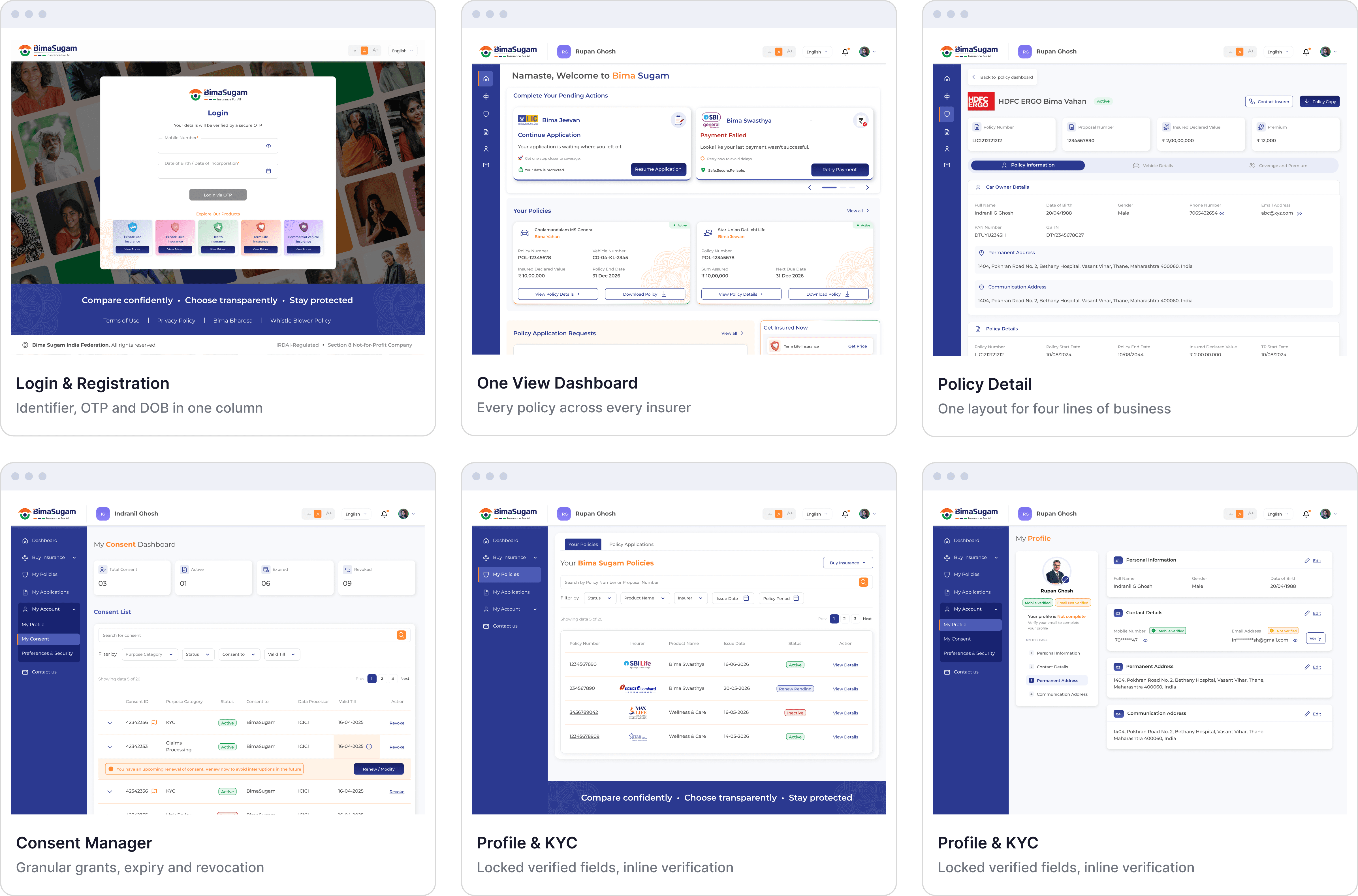
Bima Sugam — India's Unified Insurance Marketplace
→
A unified digital insurance marketplace connecting customers to every insurer through one compliant, consent-driven interface.
Insurance
Fintech

Case study — 5 min read
Read it →